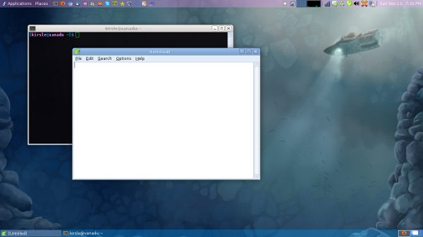
Click the screenshot for the full size version.
Along the top panel I have my Applications and Places menus, app launchers for my commonly used programs, my CPU usage graph, notification area and clock. On the bottom panel are my task bar and workspace switcher. These are all standard Xfce panel applets.
The details for anyone who's interested (the only panel applet options shown are the ones that differ from the default options):
Add a Launcher applet, set it to launch the Settings Manager (xfce4-settings-manager), rename the launcher to "System", and on the Advanced tab of the Launcher applet, check the box to "Show label instead of icon".

This won't get you a drop-down menu, but it will complete the Gnome 2 look for your main menu part of the panel. :)
There are 8 comments on this page. Add yours.
This looks exactly like what I've done mate, the only thing I can't figure out is how you got the places tab, I used ubuntu with xfce installed over the top, just waiting on 12.04 xubuntu to reformat, I tried oneric but its buggy as on my comp so I'm still on natty
The Places menu came preinstalled on the Xfce spin for Fedora. The package name is xfce4-places-plugin.
By default the applet just shows an icon and no label, but if you right click and go to its settings you can change it to show only a label, which is what I did.
Thanks mate
Speaking of "Mate", Gnome 2 was forked into the Mate Desktop Environment. It's still a bit glitchy here and there, but the bugs are being worked out quite nicely.
I'm too lazy to post a link, so jump on google, and you'll see it.
All I wanted was the trick to 'expand' the seperator. This is because, if I remove the window button all the notificaton, time etc would be left aligned, leaving lot of empty space to their right, which I hated.
Thanks a lot.
Thank you so much Kirsle! I've had this page bookmarked for well over a year, it finally came in handy as I just recently discarded my Debian Squeeze Gnome 2.3 to migrate to a clean install of Debian Wheezy with Xfce 4.8. I lived with the default XFCE for a few weeks while I got my applications and development tools set up, but finally turned my attention to bring XFCE to closely resemble the Gnome 2 workflow that works so well for me. And Debian Wheezy is XFCE 4.8, as too likely was Fedora 16 when you wrote this. I know there's a deb repro to upgrade to XFCE 4.10, but will likely let the dust settle on Wheezy becoming Debian stable before I consider migrating to XFCE 4.10. Thank you so much again for sharing this! Don
Nice layout!
You went to some trouble to replicate the Places button. I'm impressed with Xfce4's Directory Menu applet. I have two of them in my panel, each with Properties: Menu 1: Base Directory: File System
Icon: drive-harddisk
Menu 2: Base Directory: johann (my home directory)
Icon: user-home
They have replaced both Places and Terminal Emulator for me.
This is great Noah. Even with MATE being available, I still prefer (particularly in one example an older spare laptop running Debian Jessie with Xfce 4.10) to use Xfce configured with the panels like this. And of course Xfce 4.12 has just been released.
0.0108s.